When I started out making Muga Muga jewelery I sourced uncopyrighted vintage illlustrations to use in by beercap jewelery and glass and metal jewelery. I am a painter by heart and by formal training so even though these items where quirky and loved by many I wanted to create jewelery with my own art. I wasn’t sure how to go about this as it is a whole different ballgame to paint something that will work in a 12mm earring when you are used to painting on 2 x 2 meter canvas. Vintage illustrations work extremely well for tiny things, as these illustrators knew their stuff. Most of the illustrations are made out of minute dots that blends unbelievably well when changing scale.
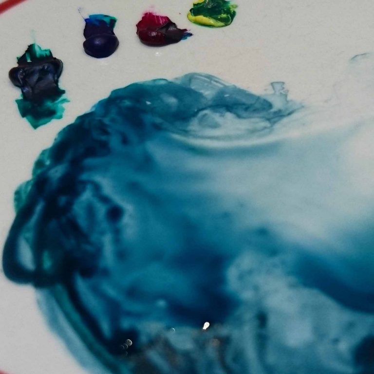
“There is just something about drawing or painting with art mediums directly onto paper that I find magic. The flowing paint, the effect of the colours while mixing, the unexpected way it turns out.”
I started out by trying to use watercolour on paper and these looked good on paper but as soon as I scanned it in and made it smaller it didn’t turn out great. It was just a question of time and trail and error to learn what works on such a small scale and what doesn’t. When painting on canvas I am quite expressive and like to use brushstrokes and texture. This didn’t translate well onto tiny earrings. I had to learn to use enough contrast, clearer shapes and less detail as this tended to get lost on the small scale.
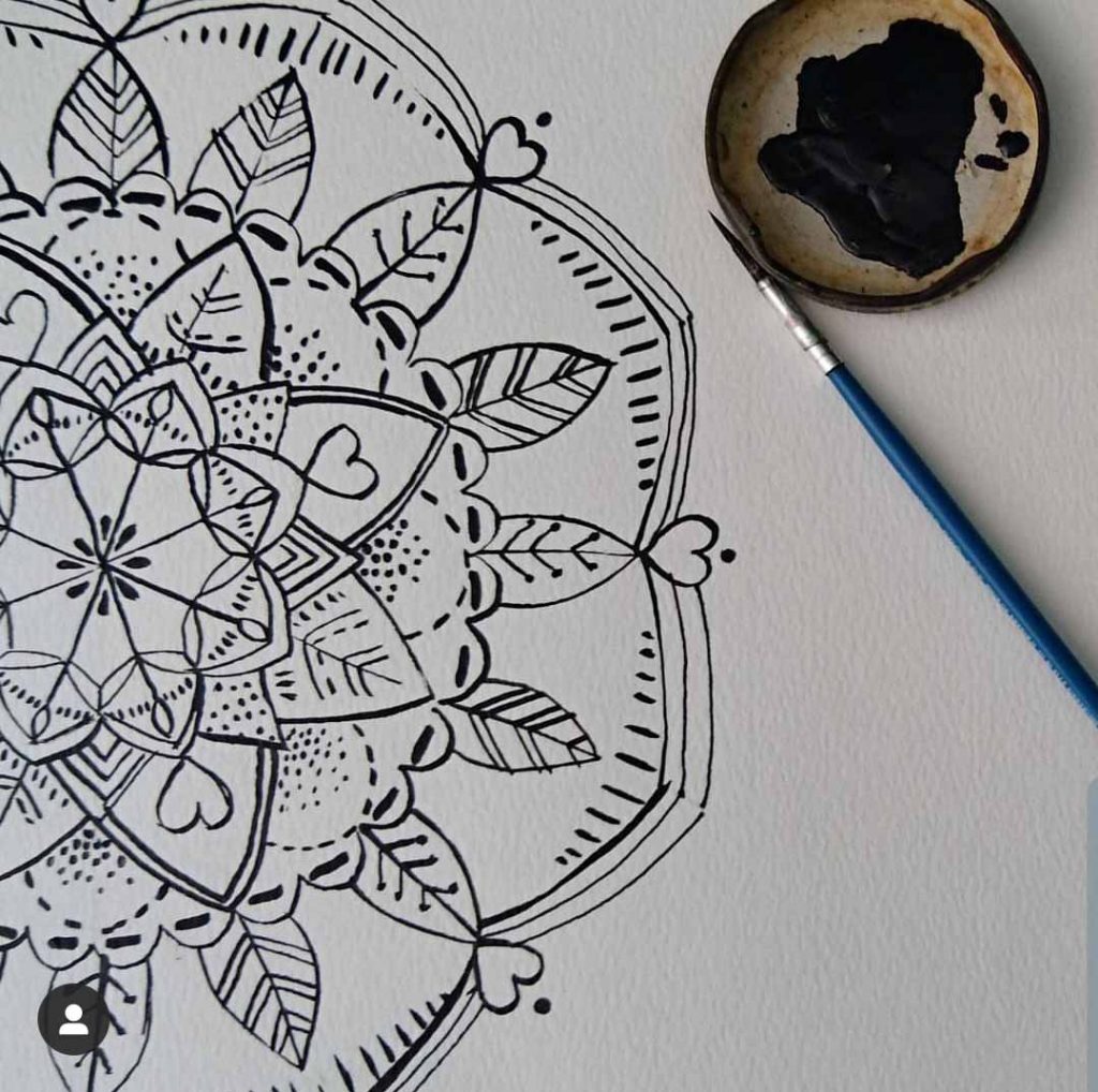
In 2017 I created my first full range called Folk Jewelery (I continued using Folk as a theme, I will go into more detail about this in another post) with my own set of art images or illustrations. For that range I used mostly uniform line drawings done in ink with brush on paper. I then scanned this in and Lauren (our graphic designer) redrew it in Coral draw. I then added colour and variations in Illustrator and Photoshop. The process of starting with lines was a good way to train my eye for the scale change between the A4 paper drawings and the final 12mm earrings.
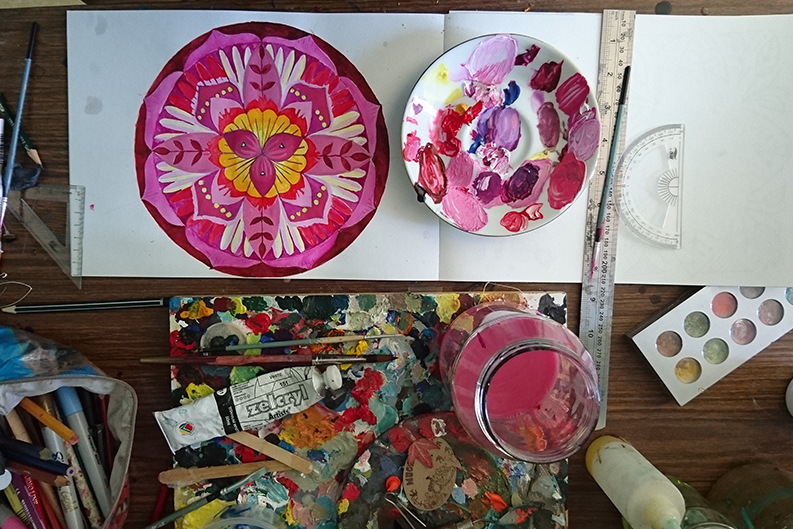
In 2018 I continued with my Folk range and created some symbolic, very colourful Mandala illustrations (I will talk more about this in another post). I painted these using gouache on paper. I started feeling more comfortable to use line and colour. I scanned these in and did quite a lot of editing on Coral Draw and Photoshop afterwards using my Wacom pen tablet. This involved cleaning up edges and adding details like fine lines. This was quite an achievement for me as I felt my love for colour and the painter in me started to come out in my jewelery more.
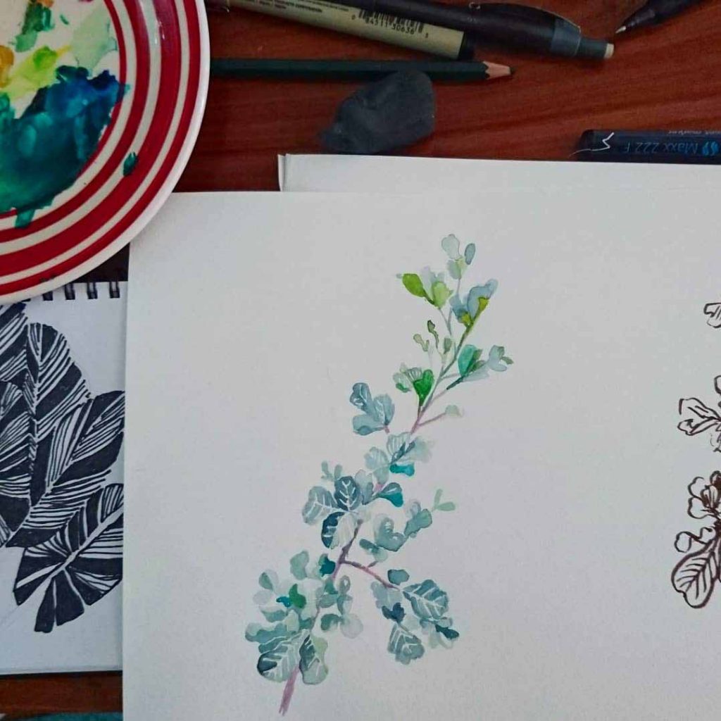
Most recently in March this year I launched a whole new range called Floral jewelery. For this range I used fineliner drawings, ink and brush drawings, watercolour and gouche on paper. I created a moodboard beforehand to help create the theme and mood that I wanted for the jewelery and then took some photos in our garden to use as reference. I am lucky enough to have two fellow artists in the Muga Muga studio, Francesca van Niekerk (she is also a freelance illustrator and do a lot of illustration work for us) and Connie (Cornelia Mokhutho) both with fine arts training. They also contributed to the Floral illustrations for this range. The paper to screen translation for this range felt easier than before. Maybe because these were looser more painterly images that didn’t need a lot of editing. It was just a question of getting a few testprints done to make sure that the colour came out right.
I am learning more about working with digital art but I suspect that painting and drawing is something that I will always stick to. I have so many more plans and dreams of things that I want to make by getting more experienced in the art of illustration. I will keep you posted!